
Cycle Hire Case Study - Using R Only
In addition to the case study project on Cyclistic using Excel, I also decided to conduct a similar analysis but exclusively using R Studio to showcase my skills and capabilities with this programming language and software. This project answers the same business problem:
How do annual members and casual riders use Cyclistic bikes differently?
The Data
For this case study, we will be comparing all rides from Q1 2019 and Q1 2020. Both quarters are downloadable as CSV files, and I subsequently uploaded these into R Studio. The first step for this analysis in R is to both read the files, assign a variable and get a brief overview, by using the following coding:
q1_2019 <- read_csv("Divvy_Trips_2019_Q1.csv")
q1_2020 <- read_csv("Divvy_Trips_2020_Q1.csv")
colnames(q1_2019)
colnames(q1_2020)
Data Cleaning
Upon reviewing the data, it became evidence that there were some discrepancies in how the data was recorded that would need to be fixed before proceeding with any analysis. Firstly, the column names varied and therefore would need standardizing by using the following code:
(q1_2019 <- rename(q1_2019
,ride_id = trip_id
,rideable_type = bikeid
,started_at = start_time
,ended_at = end_time
,start_station_name = from_station_name
,start_station_id = from_station_id
,end_station_name = to_station_name
,end_station_id = to_station_id
,member_casual = usertype
))
Once standardized, the data could be combined into one table by using the following code to assign a variable:
all_trips <- bind_rows(q1_2019, q1_2020)
A further issue identified is that between 2019 and 2020, Cyclistic used different labels to define their riders (Member & Casual vs Subscriber & Customer). To unify and standardize this, I inputted the following code:
all_trips <- all_trips %>%
mutate(member_casual = recode(member_casual
,"Subscriber" = "member"
,"Customer" = "casual"))
A before and after check of the data in R can be seen in the below screenshots:

Before standardizing rider labels

After standardizing rider labels
The next step was to add columns to the data that will allow me to aggregate ride data for each month, day, or year, by using the following code chunk:
all_trips$date <- as.Date(all_trips$started_at) #The default format is yyyy-mm-dd
all_trips$month <- format(as.Date(all_trips$date), "%m")
all_trips$day <- format(as.Date(all_trips$date), "%d")
all_trips$year <- format(as.Date(all_trips$date), "%Y")
all_trips$day_of_week <- format(as.Date(all_trips$date), "%A")
Next, I needed to calculate a total ride length for all trips:
all_trips$ride_length <- difftime(all_trips$ended_at,all_trips$started_at)
Lastly, ‘bad’ data needed to be removed such as bikes that were taken out of docks for repair or rides with negative distance. As data was being removed, when doing this I created a new table named version two:
all_trips_v2 <- all_trips[!(all_trips$start_station_name == "HQ QR" | all_trips$ride_length<0),]
Data Analysis
Firstly, I can input one simple summary() code into R to get a brief overview of the data before proceeding with the analysis:

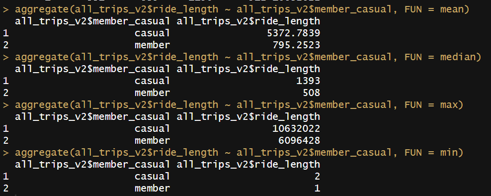
Next, I compared the data between Casual and Member riders with aggregate() codes:
A further aggregate() code can display the average ride time by each day for members vs casual users

Lastly, I inputted a final piece of code to analyze ridership data by both type and weekday. I utilized the note feature within R, by using #, so that those reviewing my code in future can see the steps I’ve taken and details as to what I did

Data Visualization
My favorite package on R is the ggplot package, enabling users to quickly visualize data with code. First up, I visualized the number of riders by rider type:

The above code chunk creates the output of the bar chart on the right. The code arranges the days, groups and summarizes the total rides by ridership type and day, and finally the ggplot code creates the graph.
The result is the graph that clearly shows the difference between the two ridership types on each day of the week, including how members use more on weekdays and casuals on weekends.


The code can be slightly amended to instead display average duration of rides:
The above code simply replaces the y axis input with average_duration rather than number_of_rides from the previous code chunk.
This graph helps to easily identify that casual riders use the bikes for far longer on average than members. Members also use the bikes for a relatively similar amount of time on average throughout the week, whereas casual riders’ average time of use varies greatly.

Conclusion
R makes it easy to quickly clean, manipulate, analyze and visualize large datasets as shown with this case study. This is beneficial when dealing with datasets too large to analyze on excel and/or when working on a tighter schedule. R is therefore an extremely valuable skill that I have learnt, harnessed and utilized in order to become a good data analyst.