
Cycle Hire - Case Study
At the conclusion of my professional data analytics course, we were given an option to complete a case study by being given access to raw data and presented with a business problem to solve. This scenario involves a fictional cycle-hire company, Cyclist. The Director of Marketing asked the Data Analytics team to provide data, analysis and recommendations for the following business problem:
How do annual members and casual riders use Cyclistic bikes differently?
The Data
To begin answering and analyzing the data, I downloaded the last 12 months of cycle-hire data. Each CSV file contained on average 450,000 rows, one for each time a bike was hired.
Cleaning, Verifying and Preparing the Data
The first step with the data was to verify and clean it. I input a =MAX function on each to discover some cycles were hired for 24 hours. After looking into this more, there was no end station to their hire and it can be assumed these hire sessions either failed or expired - as such, they should not be included in the analysis and removed, as they could skew the data and not display true insights. Trips with a duration of <= 0 minutes and distance of <= 0 meters were also removed from the data.
Further cleaning and preparing involved unifying the data for each month, including standardizing the time/data format, as well as inputting =WEEKDAY functions to derive and assign a numerical value to days from the data for future analysis. Finally, working out a total ride length by subtracting start time from end time into a new column.
Analyzing the Data
After preparing the data from each spreadsheet, I used SUMIF, COUNTIF and VLOOKUP functions to summarize the data and automatically input it into the below, master table I created:

This table summarized the over 5.5 millions rows of data from the 12 spreadsheets into one tidy table, which makes analyzing the data far easier. From this table, it is easy to spot trends, patterns and directly answer the assigned business question.
Subsequently, I created several visuals to present to stakeholders
Visualization & Presenting the Data


To begin, it is important to set the background and context through visualizations. These two emphasize the volume of ridership and the variance in ridership type. Both visuals immediately answer the question at hand, too, by showing that there is almost a 2:1 split between ridership types throughout the year. Finally, they also serve to set a color scheme that will be continued throughout the visualizations to make reading and interpreting the data easier.
Next, my analysis of the data discovered some key differences between the two membership types’ usage of bikes in the following ways:

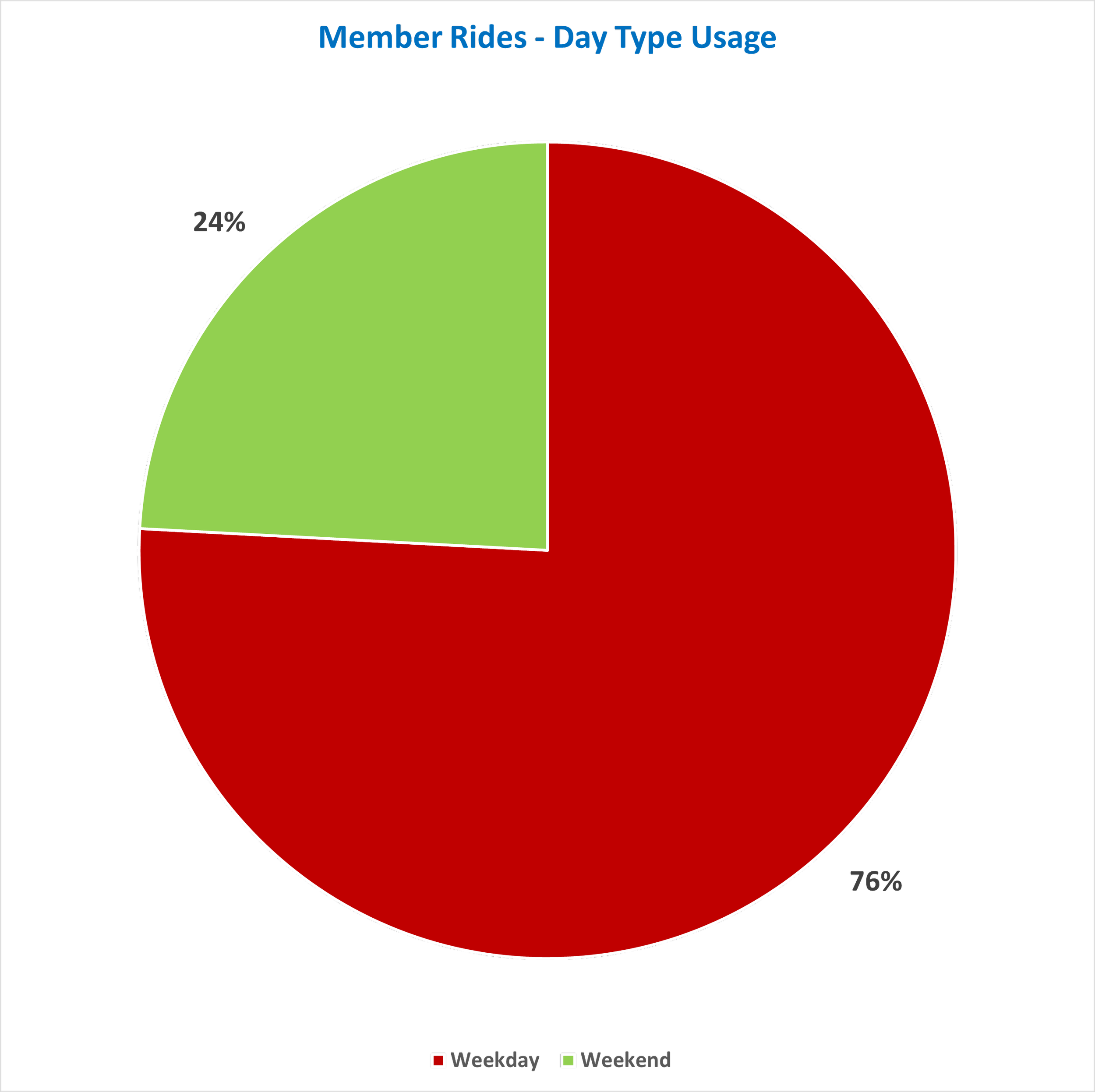
This visual helps to showcase the varying usage of bikes throughout the week between the two ridership types. Members use them fairly consistently throughout the week, whereas casual ridership peaks dramatically on weekends.
To help visualize this further to stakeholders, I created the following two visuals from the data:
A further insight gained by analyzing the data was that the average ride length between the two types of ridership, as shown below:

Casual riders were using the bikes twice as long on average. Once again, more insight could be gained by breaking it down further:

Again we see the trend of consistent usage by members throughout the week, and varying usage for casual ridership.
Finally, from the data, I was able to make one final insight to showcase where there isn’t much difference between ridership types throughout the year to show to stakeholders:

This line graph helps to display that ridership drops off dramatically during Winter for both types.
Conclusion & Recommendations
Analysis and visualization of the data have enabled me to answer and showcase the original business question of ‘how do annual members and casual riders use Cyclistic bikes differently’ in the following ways
Annual members use Cyclistic twice as often as casual riders.
Annual members use Cyclistic at a consistent rate throughout the week, whereas casual usage increases and peaks drastically on weekends.
Casual riders use Cyclistic twice as long as annual members on average for each cycle hire.
Both rider types use Cyclistic less during Winter, colder months for a peak low of 138,689 in January (versus 821,276 in September)
Subsequently, I am able to make the following recommendations to stakeholders:
Attempt to convert casual riders into annual members, and focus marketing campaigns to do so during the peak period of Summer
Reach out to casual riders during the week and annual riders during the weekend, to incentivize them to use the services more during these periods where they currently do not.
Incentivize all riders to use Cyclistic more during Winter months, perhaps through discounted membership rates or cost-to-hire.
Finally, as a data analyst I would suggest further review into usage between the two member types if locational data could be retrieved on each hire. Determining distance travelled for all rides and comparing between ridership types, days of the week, months of the year as well as popular start/end locations could lead to further valuable insights.
PowerPoint Presentation
In addition to creating this report, I also created a PowerPoint presentation to showcase how I would present the data in a meeting to stakeholders
Additional Data & Visualizations
I believe that any good data analyst will provide as much information and visualization as possible to stakeholders. As such, I created a few visuals that may not necessarily answer the business question at hand but may prove to be valuable to the company regardless. In a presentation or report, these would be included in an appendix and shared for informative purposes only


